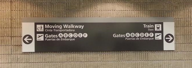
I was headed to LA to visit my brother’s family and got lucky with airport security. To kill time before my flight (and in anticipation of the 4.5 hour flight), I decided to walk to my terminal instead of taking the plane train. For those of you unfamiliar with the Atlanta airport, it has 2 security checkpoints for its 7 terminals. This means everyone enters at roughly the same point and takes either the plane train (airport subway) or the underground walkway to reach the parallel terminals. On this visit, I used the North Security Checkpoint for the first time, so when I got out at terminal T, I wasn’t sure which direction would take me to terminal C. The sign above wasn’t immediately helpful. At first I focused on only the “Gates” part of the sign assuming the other information was for the restroom or baggage claim. When that wasn’t helpful, I looked at the “Moving Walkway” and “Train” parts, but I was still confused by the arrows indicating that the gates were both to the left and to the right of the sign. It took me a while to realize that I could reach the gates (which were to the left) by taking the moving walkway to the left or by taking the train, which had a station to the right.
The design of this sign, like most airport signs, is generally very good. It uses understandable icons to convey meaning to non-English speakers. I particularly like that the background is dark with light words and images because it makes it stand out from the wall without compromising on contrast. If I were to change the sign, I would indicate that each of the “Gates” parts are specific to the “Moving Walkway” and “Train” parts. This could be done by making the “Gates” parts smaller and indenting them. Alternatively, using words to indicate the relationship between the two parts would be more descriptive, but because many viewers won’t understand English, that would probably not be the better option.
Connection to learning: While viewing this sign, I fell prey to the expert-novice gap. Now that I know the meaning of the sign, I have a hard time understanding how I didn’t understand it initially. As a novice though, figuring out how the pieces of the sign were related was not easy. Even to me, someone who visits this airport regularly and has studied sign design. As Bransford et al. (2000) argue, novices often need more support to learn something new than experts realize. I’m adding my confusion by this sign to the thousands of other cases that support their argument.
How people learn: Brain, mind, experience, and school: Expanded edition. (2000). Bransford, J. D., Brown, A. L., & Cocking, R. R. (Eds.). Retrieved from http://www.nap.edu/openbook.php?isbn=0309070368
For more information about the bad design series or more bad design posts, visit the bad design series introduction.

Pingback: Bad Design: Series Introduction | Lauren Margulieux
A lot of the signs for the security checkpoints at the ATL airport are confusing because they are not used properly or are in the wrong place, or not at head level when they should be.