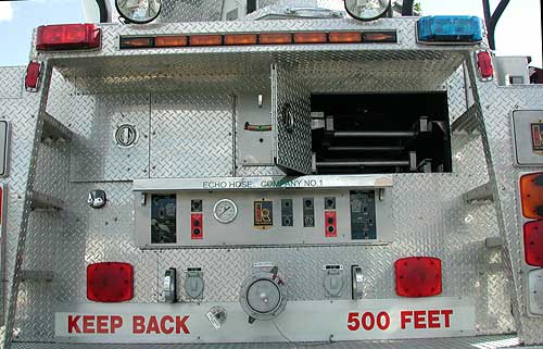
As I was headed home the other day, I stopped behind a fire truck at a red light. As soon as I saw the sign that reads, “KEEP BACK 500 FEET,” I stopped. I was probably 25-30 feet behind the truck. I started to feel guilty about not following the instructions that are likely for my safety, but then I thought about how far 500 feet is.The only way I could conceptualize 500 feet was in terms of football fields. For those of you like me, 500 feet is almost 2 football fields! I wouldn’t have even been able to see the sign from that distance. Even if the sign covered the entire back of the truck, I probably wouldn’t be able to read it from that far away (and that’s assuming nothing was in my line of sight and I was paying attention to it).
Other aspects of the design are generally fine. The contrast between colors is good, and the red color and block letters denote urgency. The spacing between “KEEP BACK” and “500 FEET” is not ideal but acceptable in the daylight with the white background connecting the two pieces. In the dark, the two pieces are less likely to be intuitively integrated. I’m not sure how to redesign this sign to be more effective other than to make it larger, but as suggested before, I’m not sure it could be made large enough to match the distance.
Connection to learning: The physical design of instruction can be just as important as the cognitive design of it. Especially for large classrooms, appropriate size and color contrast of words and images are necessary considerations for visual aids. I’ve seen a powerpoint with yellow text on a white background, and just because those are school colors does not make that contrast comfortable for the viewer. Proximity of related information is also important. For the image above, a person could interpret “KEEP BACK” and “500 FEET” as separate given their spatial separation, even if most people would understand that they are together. To avoid confusion, pieces of information that are related should be placed together (Mayer, 2009).
Mayer, R. E. (2009). Multimedia learning (2nd). New York: Cambridge University Press.
For more information about the bad design series or more bad design posts, visit the bad design series introduction.

Pingback: Bad Design: Series Introduction | Lauren Margulieux