When handling quantitative data, there are a number of steps that need to be completed before you can run your first test. This post describes a basic protocol for data cleaning and tools that you can use for analysis.
Creating a Data File
When you create your data file, analytic software expects that individual participants are represented on the rows and variables are represented on the columns like in the example table below.
| IV1 | IV2 | Age | Major | DV1 | DV2 | |
| 1 | 1 | 0 | 21 | 3 | 19.5 | 5 |
| 2 | 0 | 1 | 20 | 2 | 20 | 4 |
| 3 | 1 | 1 | 20 | 1 | 17.5 | 6 |
| … | 0 | 0 | 19 | 4 | 15 | 6 |
To use statistical analysis software, your data will need to be numeric, though it can be at any level of measurement. Be sure that you keep a codebook to link your numeric codes to their actual meaning. This is imperative so that other people (including your future self) can decipher the data file if needed. For example, for the demographic data under “Major,” a codebook would tell you what “3” means.
Analytics Software
SPSS and Stata
Pros: Best for straightforward statistical analyses. SPSS and Stata are easy to learn, with many tutorials available. Can set up tests with the graphical user interface or syntax. Includes support and vets new statistical techniques.
Cons: Licensing is expensive but common at universities. Does not support abnormal sets of data or advanced analyses.
SAS
Pros: Supports greater complexity in statistical analyses and includes more advanced statistical techniques than SPSS and Stata but is slightly harder to learn. Can set up tests with the graphical user interface or syntax. Includes support and vets new statistical techniques.
Cons: Licensing is more expensive but might be provided through universities.
R
Pros: Free analysis software that can do everything the others can do, but it doesn’t inherently use a graphical user interface. It is open source, so the latest techniques are released in R first.
Cons: All analyses must be written (or copied and modified) in code or created in 3rd party tools. Because tools are created by the community rather than a central design framework, R can have a steep learning curve.
Distribution of Scores
Once you have all of your data, look at a histogram of the frequency of the scores for each dependent variable. In the histogram, the y-axis will be frequency, and the x-axis will be scores on the dependent variable. You’re looking to see if your scores are normally distributed. Normal distributions follow a bell curve (see figure below). If you are comparing groups, look at histograms for each level of the independent variable. Otherwise, your data will look multi-modal (i.e., have more than one peak).
If you have more than 5-10 possible scores on the dependent variable, your histogram will likely have big gaps in it. You might bundle some groups together to balance out these gaps. For example, if you gave a test on which the possible scores were 0-100, you might bundle scores that are A, A-, B+, B, etc. Otherwise, you might see a gap for, say, 86 that could make the distribution look non-normal.

Don’t be discouraged: Real data won’t fit the normal distribution as perfectly as in the figure. As long as the general shape of your data is similar to the bell curve, you can assume a normal distribution.
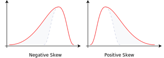
Most statistical tests are intended to be used with data that are normally distributed. Distributions can deviate from the normal distribution in kurtosis or skewness. Kurtosis, meaning how flat or tall the distribution is, largely doesn’t matter for basic statistical tests as long as the distribution is symmetrical. If your data are skewed to one direction or the other (see figure below), then you’ll need to be careful about which analyses you use. Non-normal distributions are typically analyzed with non-parametric tests such as Mann-Whitney or Kruskall-Wallis. Data can also be multi-modal, meaning that it has more than one peak. Multi-modal distributions cannot be analyzed with the statistical tests described in the following statistics posts.
Outliers and Missing Data
Two common issues you will deal with during data cleaning are outliers and missing data.
Outliers are participants who score outside of three standard deviations from the mean. Because three standard deviations on either side of the mean in a normal distribution represent over 99% of the population, it is common practice to exclude these participants from analyses. Based on this criteria, fewer than 1% of your sample should be excluded as outliers. Some researchers use two standard deviations as the cut-off instead (95% of the population).
Missing data occur when participants intentionally or accidentally skip questions. For performance-based measurements, it is safer to assume that they intentionally skipped the question and not give them points. For answering long, scale-based measurements (e.g., self-efficacy), it is safer to assume that they accidentally skipped the question and fill in the data. One strategy for uni-dimensional scales, which measure only one construct, is to fill in the missing data with the average response for that participant. This strategy will keep the participant’s average score the same. For multi-dimensional scales, one strategy is to fill in the missing data with the average response for that item. This strategy will keep the item’s average score the same. If more than 90% of participants are missing data, you instead should consider whether to include participants with missing data.
To view more posts about research design, see a list of topics on the Research Design: Series Introduction.

Pingback: Research Design: Series Introduction | Lauren Margulieux
Pingback: Research Design: What Statistical Significance Means | Lauren Margulieux
Pingback: Research Design: Descriptive Statistics | Lauren Margulieux